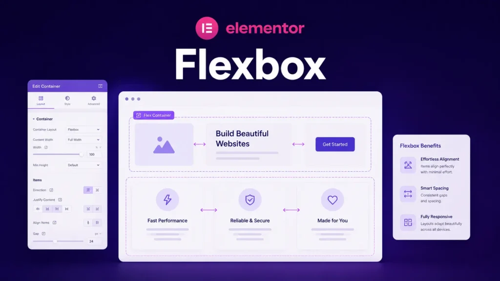
Flexbox sounds intimidating if you’ve heard it mentioned in developer circles. But from Elementor’s perspective, it’s just a layout system that controls how items inside a box are arranged and spaced.
Think of it this way: you have a container that holds multiple items, maybe a logo and menu side by side, or three feature boxes in a row. Flexbox controls how those items sit relative to each other. It’s the difference between items stacking vertically, sitting side by side, or spreading out evenly across the space.
In Elementor, you don’t need to understand how Flexbox works in code. You just need to understand what it does visually and how to control it through the interface.
What Flexbox Does Visually
Imagine you have three boxes inside a larger . Without Flexbox settings, they might stack on top of each other by default. With Flexbox, you can make them sit horizontally in a row. You can space them evenly. You can push them to opposite sides. You can center them.
That’s Flexbox. It’s a system for positioning and spacing items inside a container.
Here’s the practical starting point: every time you put multiple items or smaller boxes inside a larger one, Flexbox is controlling their behavior. It’s what determines whether they stack, spread out, or align in a specific way.
The Main Flexbox Controls in Elementor
When you select a and look at the layout options, you’ll see several controls that are actually Flexbox settings. You don’t need to memorize all of them, but understanding what they do visually is useful.
Direction controls whether items flow horizontally (left to right) or vertically (top to bottom). If you have a row of buttons, direction is set to horizontal. If you want them stacked, set it to vertical.
Alignment controls how items spread across the available space. You can align them to the start (left for horizontal layouts), center them, spread them evenly, or push them to both edges. This is how you control spacing between items without manually setting individual margins.
Justify (sometimes called “justify content”) does similar work for spacing along the main direction. It determines how items are positioned along the line they’re on, whether they bunch up on one side, spread out evenly, or space themselves in a specific way.
These controls sound abstract until you start playing with them. Then it becomes obvious: change the setting, and the items rearrange themselves.
Practical Layout Scenarios
Let’s think through real layouts you’d build.
Say you’re creating a header with a logo on the left and navigation on the right. You’d put both inside a . Then you’d set the direction to horizontal (so they sit side by side). Then you’d use alignment to push them to opposite ends—logo to the left, nav to the right.
Or you’re building a three-column feature section. You’d create a large and put three smaller inside it. You’d set the direction to horizontal. Then you’d set alignment to space them evenly across the width. Now you have three columns with even spacing.
Or you’re stacking content vertically—a heading, then a paragraph, then a button. You’d put all three inside a , set direction to vertical, and adjust spacing to control the gaps between them.
The pattern is the same: you create a container that holds items, you decide how they should flow (horizontal or vertical), and you control spacing. That’s basically all Flexbox does.
A Visual Way to Think About It
Here’s a mental model that helps: Flexbox is like a container that knows how to automatically arrange its contents based on your instructions.
Imagine a row of books on a shelf. The shelf is your . The books are your items. Now imagine the shelf has controls:
- You can make the books stand upright or lay flat (direction)
- You can push all the books to one end or spread them evenly across the shelf (alignment)
- You can control the gaps between them (spacing)
- You can make them all the same width or let them keep their natural size
That’s Flexbox. You’re not manually positioning each book—the shelf handles it based on your settings.
Common Flexbox Mistakes Beginners Make
When people first use Flexbox in Elementor, they often add items and wonder why they’re not positioned correctly. Usually it’s because they’re not thinking about the flow direction.
If you want items side by side and they’re stacking vertically, you probably need to change the direction from vertical to horizontal. If items are spreading out when you want them centered, you need to adjust the alignment.
The key is understanding that Flexbox controls layout automatically based on its settings. If something looks wrong, the first question is: what’s my direction setting? The second is: what’s my alignment?
Most layout problems solve themselves once you think about these two settings.
Flexbox and Responsive Design
One reason Flexbox is so useful is that it can adjust layouts automatically on different screen sizes. You can have items sit horizontally on desktop but stack vertically on mobile. You can space items one way on desktop and another way on tablet.
We’ll get into responsive design more in a later article. For now, just know that Flexbox is the system that makes responsive layouts possible. It’s what allows your layout to adapt.
The Relationship Between Containers and Flexbox
Here’s how these pieces fit together: you use to build your page structure. You use Flexbox to control how items inside those sit and space.
Think of it like building with blocks. Containers are the blocks. Flexbox is the system that determines how the blocks arrange themselves when you put multiple blocks next to each other.
You don’t need to pick between understanding containers or Flexbox. You need both. Containers are the structural units. Flexbox is how you control their layout.
How to Approach Flexbox in Practice
The best way to learn Flexbox is by doing, not by memorizing settings.
Start with a simple two-item layout. Create a , put two smaller inside it, and then play with the direction and alignment controls. Change direction from vertical to horizontal. Notice what happens. Change alignment and watch the items reposition.
Do this a few times with different numbers of items. Try three items. Try five. Try items of different sizes. Each time, experiment with the direction and alignment settings to see what they do.
Once you understand those, you’ll intuitively grasp what other controls do when you encounter them.
What’s Next
Now you understand what Flexbox does and how to use it to build layouts. The next step is understanding the actual building blocks of your content—the elements and widgets that go inside your layouts.
In the next article, we’ll talk about widgets, which are the pre-built components Elementor gives you to fill your layouts with content.