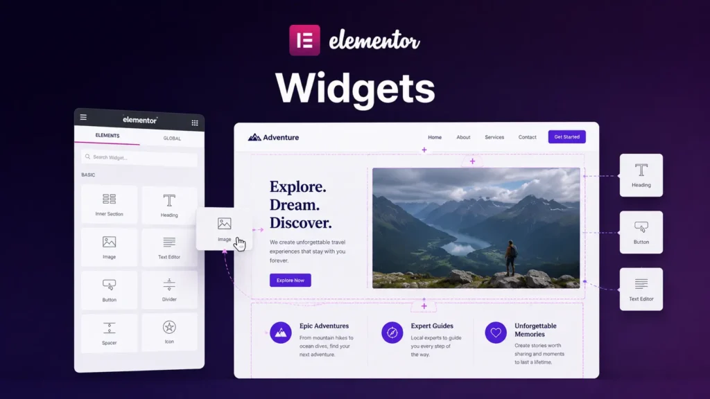
You’ve learned about containers and how they structure layouts. Now it’s time to fill those layouts with actual content. That’s where widgets come in.
A widget is a pre-built component that does a specific job. A text widget displays text. An image widget displays an image. A button widget is a clickable button. Instead of building these from scratch, Elementor gives you widgets that you just customize and drop onto your page.
Think of widgets like furniture. Containers are the rooms in your house. Widgets are the pieces of furniture you put in those rooms. A chair is a chair. A table is a table. You don’t build them. You just pick one, place it, and adjust it to your needs.
What Widgets Do
The purpose of a widget is straightforward: it lets you add a specific type of content or functionality without needing to know how to build it yourself.
A heading widget adds a formatted title. You change the text, pick a font size, adjust the color. A paragraph widget adds body text. An image widget adds a picture. A button widget adds a clickable button with a link.
Elementor comes with dozens of widgets. Some are simple (like text and images). Some are more complex (like forms, sliders, or image galleries). But the principle is the same: you drop it on your page, customize it to match your design, and it works.
The practical benefit is speed. Instead of hand-coding a contact form or testimonial block, you use a widget that already handles the structure. You just configure it.
Widgets vs. Containers
Here’s an important distinction: containers hold things. Widgets are things.
You use containers to build your page structure and control layout. You use widgets to add content and functionality. Most pages are a combination of both. You have a container that spans the width of your page. Inside it, you have two smaller containers side by side. Inside those, you have text widgets, image widgets, and button widgets.
The hierarchy looks like this: page → containers → widgets.
Common Beginner Widgets
You don’t need to learn every widget that exists. Start with the ones you’ll actually use.
A text widget is for paragraphs, descriptions, and body text. It’s one of the most fundamental widgets.
A heading widget is for titles and section headings. You control the size, style, and appearance.
An image widget adds a picture to your page. You can set its size, add captions, and control how it displays.
A button widget is a clickable element with a link. You customize the text, color, and where it links to.
A spacer widget adds empty space between elements. It’s useful for controlling gaps without creating new containers.
These five cover a huge amount of what beginners actually need to do. Everything else is additional.
How to Add and Customize Widgets
The workflow is simple. You select a container on your canvas. In the left panel, you browse the widget library and find the widget you want. You drag it into your container. Now it’s on your page.
Once it’s there, you customize it. For a text widget, you click inside and type or paste your content. For an image widget, you upload or select an image. For a button widget, you add text and a link destination.
You style it using the right panel. Change the font, size, color, spacing, background. Everything you’d expect to control is there.
The key insight is that customization is contextual. Different widgets have different settings because they do different things. A text widget has font options. A button widget has link options. You learn the settings as you use them.
Why You’d Choose One Widget Over Another
Sometimes there are multiple ways to add similar content. You could use a text widget for a description, or a testimonial widget if you’re showing a customer quote. You could use an image widget for a photo, or a gallery widget if you’re showing multiple images.
The choice usually comes down to: does this widget give me the structure and styling I need without extra customization?
A testimonial widget pre-styles a quote with attribution. If that matches your design, great. If you need something completely different, you might just use a text widget and style it yourself. There’s no “right” choice. It depends on whether the widget does what you need.
When to Create Custom Widgets vs. Using Built-In Ones
For beginners, use the built-in widgets. They cover most scenarios. If you find yourself needing something that doesn’t exist, that’s a sign you might need a plugin or a custom solution. But start simple. Most websites don’t need custom widgets.
Building a Section with Widgets
Let’s walk through a practical example to see how this works together.
Say you’re building a feature section with three items. Each item has an icon, a heading, and a description.
You’d create a container that spans your page width. Inside it, you add three smaller containers arranged horizontally. Inside the first of those three, you add an image widget for the icon, a heading widget for the title, and a text widget for the description. You repeat this for the second and third containers.
Now you have three columns, each with structured content. The containers control the layout. The widgets provide the content.
You’re not thinking about each piece individually. You’re thinking about the structure: a three-column grid where each column has icon, heading, and text. Containers give you the grid. Widgets fill it with content.
What Happens When Widgets Break or Look Wrong
If a widget displays strangely (text overlapping, images too big, spacing off), it’s usually a styling issue or a container sizing issue, not a widget problem.
First, check the widget’s own settings. Maybe the text size is too large or the image width is set incorrectly. If that’s fine, look at the container. Maybe the container is too narrow. Maybe the spacing settings are off. Most visual issues resolve by checking either the widget settings or the container that holds it.
Next Steps
Now you understand the building blocks of Elementor: containers for structure, widgets for content. The last piece is understanding how these adapt to different screen sizes.
In the next article, we’ll talk about responsive layouts. This is how to make your designs work on phones, tablets, and desktops.