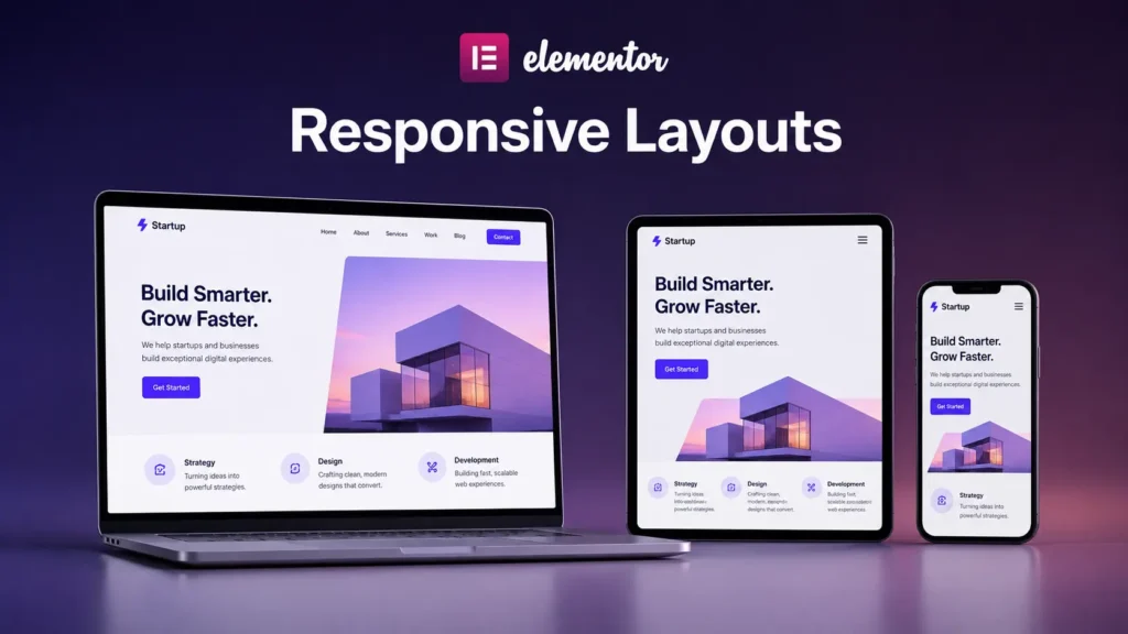
By now, you understand how containers structure layouts and how widgets add content. There’s one more crucial piece: making sure your layouts work on phones, tablets, and desktops.
Responsive design sounds like a technical term, but it’s just this: your page should look good and function properly no matter what device someone uses to view it. A layout that works on a 27-inch desktop monitor might be broken on a 5-inch phone. Responsive design fixes that.
Elementor makes this straightforward. You design once, and then you adjust how things look on smaller screens. You don’t build separate pages for mobile and desktop. You build one responsive layout that adapts.
What Responsive Design Actually Means
Here’s the practical reality: phones are narrow. Desktops are wide. A three-column layout that looks great on desktop is impossible to read on a phone if all three columns are still three columns.
Responsive design is about adapting your layout to the screen size. On desktop, you might have three columns. On mobile, those three columns stack into one column so the text is readable.
That’s it. You’re answering a single question for different screen sizes: how should this layout look on this device?
How Elementor Handles Responsive Design
Elementor lets you control how your layout looks on different screen sizes right inside the interface.
At the top of the editor, you’ll see tabs or buttons that let you switch between “desktop,” “tablet,” and “mobile” views. You can click on desktop and design your layout. Then click on mobile and see how it looks. If three columns are too cramped, you can make them stack into one column just for mobile.
The key thing to understand: you’re not creating three separate designs. You’re creating one design with adjustments. On desktop, columns are side by side. On mobile, you adjust the same containers to stack vertically. One layout adapting.
The Mental Model: One Design, Multiple Views
Think of it like a responsive piece of clothing. A jacket fits differently depending on the season. In winter, you wear it fully buttoned. In fall, you might leave it unbuttoned. The jacket is the same, but how you wear it adapts to the conditions.
Your Elementor layout is the same. The containers and widgets are the same across all devices. But on mobile, you might hide some elements, stack others vertically, or adjust spacing. You’re adapting one design to different screen sizes, not building separate designs.
Starting Your Responsive Workflow
Most designers start on desktop and then adjust for mobile. That’s a sensible approach.
You design your full desktop layout first. Once it looks good at full width, you switch to mobile view and see what breaks. Usually three-column layouts need to become single-column. Horizontal spacing might be too tight. Some elements might need to be hidden on mobile.
Then you make those adjustments. You’re not redesigning. You’re adapting what you already built.
The alternative is designing mobile-first. You design for the smallest screen, then adapt for larger screens. This forces you to think about what’s essential. Both approaches work. Pick whichever feels natural to you.
Practical Responsive Adjustments
The adjustments you make are usually straightforward.
Stacking: A two-column layout on desktop becomes single-column on mobile. You use flexbox settings (direction and alignment) to make it stack.
Hiding: Some elements look fine on desktop but are unnecessary on mobile. You can hide them on smaller screens.
Spacing: Margins and padding that look good on desktop might be too tight on mobile. You adjust padding and gaps for smaller screens.
Font sizes: A large heading on desktop might be oversized on a phone. You reduce font sizes for mobile readiness.
Image sizes: An image that’s 800 pixels wide on desktop can’t be 800 pixels on a 390-pixel phone screen. You adjust image widths for different devices.
These aren’t advanced techniques. They’re common-sense adjustments that make your layout usable on phones.
How Containers and Flexbox Enable Responsive Design
Remember how flexbox controls how items are arranged? That’s what makes responsive design possible.
On desktop, you might have a horizontal layout with items side by side. On mobile, you change the flexbox direction from horizontal to vertical, and those items stack. Same containers, same widgets, different arrangement based on screen size.
It’s why understanding containers and flexbox first was important. Responsive design builds on that foundation.
Common Responsive Patterns
Some layouts are more common than others. Learning these patterns makes responsive design feel less mysterious.
Hero sections usually stay full-width on all devices. The content inside might adjust, but the section spans the screen width.
Two-column layouts (text on left, image on right) are common on desktop but usually become single-column on mobile. The image moves below the text.
Multi-column grids (three columns, four columns) become fewer columns on tablet and single-column on mobile.
Navigation bars that are horizontal on desktop often become vertical or collapse into a menu on mobile.
These patterns aren’t rules. They’re common approaches that usually work well.
How to Check If Your Layout Is Actually Responsive
The simplest test is to resize your browser window. Start at full width and drag the edge inward. Watch how your layout responds. Do columns stay readable as the window gets narrower? Does text get cut off? Do images scale properly?
If you can resize the window and the layout stays usable at all sizes, you’re doing responsive design right. If things break at certain widths, those are the points where you need to make adjustments.
Elementor shows you exactly how your layout looks on different devices. Use that to find the problem spots and fix them.
Elementor’s Built-In Responsive Previews
In the editor, you can switch between device views. Desktop, tablet, and mobile buttons let you see exactly how your layout looks on each size. Use these constantly while building. Design on desktop, check tablet, adjust mobile. This workflow prevents surprises when your site goes live.
Responsive Design Isn’t Perfect
One reality check: responsive design is about making your layout usable on different devices, not about making it identical on all devices. A desktop layout can be different from a mobile layout. They just need to be readable and functional.
Don’t aim for pixel-perfect matching across devices. Aim for usable and clear on all devices. That’s the actual goal.
Bringing It All Together
Now you have the full picture. Containers handle structure. Flexbox controls layout. Widgets provide content. Responsive design makes it all work across devices.
Here’s the complete workflow: start with a container structure. Fill it with widgets. Use flexbox to arrange them. Then adjust for mobile and tablet. One design, multiple views.
That’s how professional websites work. And now you know how to build them in Elementor.
The best way forward is to start building. Pick a simple page, maybe a service page or landing page, and put all of this into practice. Design it on desktop. Adjust it for mobile. See what happens. That’s where real understanding comes from.