When building responsive layouts in Elementor, one of the most common challenges is handling headings that look great on desktop but awkward on mobile.
A common “quick fix” is to:
- Duplicate headings
- Hide one on desktop and one on mobile
- Or inject
<br>tags directly into the text
While those methods work, they aren’t ideal from a maintainability, accessibility, or SEO standpoint.
In this guide, I’ll show you a clean, professional approach that:
- Uses one semantic heading (
h1,h2, etc.) - Keeps the same text for all devices
- Controls line breaks purely with CSS
- Works perfectly with Elementor
- Is safe for Google and screen readers
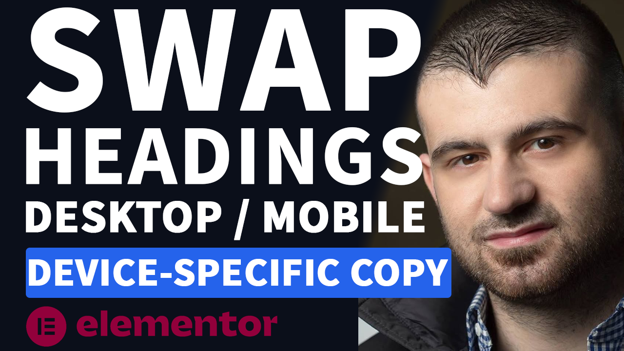
The Goal
We want this behavior:
Desktop:
Tutorials I Create. Plugins I Build. Tools I Recommend.Mobile:
Tutorials I Create.
Plugins I Build.
Tools I Recommend.All using one heading.
Step 1: Add the Heading in Elementor
Add a normal Heading widget in Elementor and use your preferred heading level (H1, H2, etc.).
For the heading text, use this exact structure:
<span class="break">Tutorials I Create.</span>
<span class="break">Plugins I Build.</span>
<span class="break">Tools I Recommend.</span>Important notes:
- There are no
<br>tags - The text is written on one line
- Each phrase is wrapped in a
<span>for layout control
This keeps the content intact while giving CSS something to work with.
Step 2: Add a Reusable CSS Class
Click the heading widget, then go to:
Advanced → CSS Classes
Enter this class name:
custom-headingThis class will be applied to the widget wrapper, not the heading text itself — which is important for the CSS we’ll write next.
Step 3: Add the CSS (Global)
Now go to Appearance → Customize → Additional CSS
Paste in the following code:
/* Desktop: keep everything on one line */
.custom-heading .elementor-heading-title .break {
  display: inline !important;
}

/* Mobile: stack each phrase on its own line */
@media (max-width: 768px) {
  .custom-heading .elementor-heading-title .break {
    display: block !important;
    width: 100%;
  }
}
Click Publish.