The Problem with “Inline Flex” in Elementor V4

Update — April 16, 2026
After speaking with Elementor, I was told that setting the container width to Auto allows inline-flex to behave as expected. I tested this, and it does work — the container will shrink to its content and the difference becomes visible. ..
However, this behavior isn’t obvious from Elementor’s UI, and under default settings the effect is effectively hidden.
It’s also worth noting that in standard CSS, inline-flex does not require manually setting the width to auto to behave this way. That makes this less of a CSS limitation and more of how Elementor’s container system handles sizing.
Ideally, this behavior should be clearer — or the default width should allow inline-flex to behave as expected without additional adjustments.
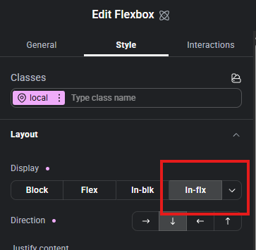
If you understand CSS, then you understand that flex takes up the full width of the container, while inline-flex is supposed to hug the content and only take up the space it actually needs. Well, in Elementor, the inline-flex option in V4 is kind of frustrating because when you click inline-flex, nothing happens.
Why it’s not working
I can confirm that inline-flex is being applied when I inspect the page with the DevTools. The problem is Elementor’s container system is forcing the container to act full-width anyway. So even though the CSS is technically correct, the visual result is not. You’re basically using a setting that is getting overwritten by Elementor’s container system.
If you’re not fully familiar with how Elementor’s container system works, I break it down here in my Elementor Containers & Grids Tutorial.
How to fix it
If you actually want the container to work like inline and shrink to its content width, you can force it with the CSS code below. Once you set that, the container stops stretching across the screen.
width: fit-content;The Takeaway
Elementor’s UI makes it seem like inline-flex should just work out of the box, but that’s clearly not happening (at least not for my demo site). For my demo site, where I test everything (a clean test environment), I am using the latest version of Elementor Pro + Hello Theme. I have no other plugins or themes installed that could be conflicting with Elementor.
Until Elementor resolves this issue, I recommend controlling the width using the CSS I provided above instead of relying on the inline-flex option, which does absolutely nothing.
And, unless I’m missing something here, this honestly feels like a flaw in how V4 is handling containers. If you’ve actually gotten inline-flex to work properly without forcing width, I would love to hear about it!
As of 4/14/26, to make sure I wasn’t missing something, I reached out to Elementor’s support directly and sent the following message:
I’m testing a clean setup (Elementor + Hello Theme only).
When I switch a container from
flextoinline-flex, there is no visible difference.
display: inline-flexis applied (confirmed in DevTools), but it has no effect on layout.Can you please send a quick video showing
inline-flexworking with a clear visible difference inside Elementor? I want to confirm if I’m missing something.
I will update this article with any updates received.